

How to create a gallery wall.
A gallery wall can work in any space in your home! It can add so much personality, style and visual interest to any wall. Consider this blog as a guide for you to use as you create your own personalized gallery wall.
The perfect frames for every style: My top picks for a polished look
1. Choosing the Right Wall:
When selecting the best wall for your project, I suggest selecting one that is a focal point when you enter the room or the one behind a sofa or bed headboard, also the largest wall in your space. Walk thru your room and look around, which wall would you feel need attention? which wall is large and currently have very small decor and you can never fill? Trust yourself here, I know you will choose the right one!
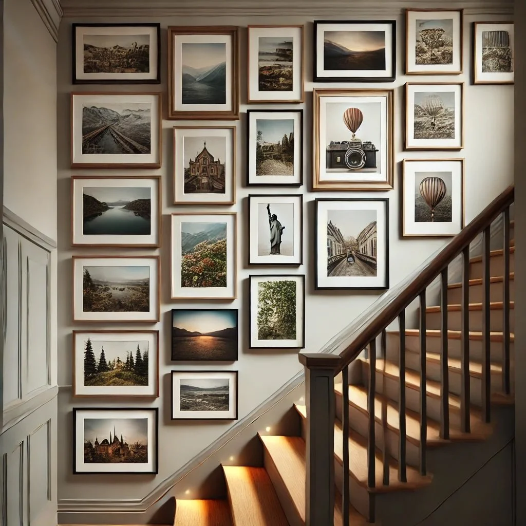
Consider high-traffic areas like living rooms, hallways, or staircases, and even entryways, home offices are a good place too.
Image is AI created by Maru McHenry.
2. Planning the Layout:
It’s very important to plan before hanging artwork. I like to take a picture of the wall and print it and draw several layouts on it first. This is the most skipped step.
Lay out frames on the floor first or using paper templates of your frames on the wall, painters tape is must so you don’t damage your paint.
There are different layouts:
Grid: A gallery wall in this format adds order and elegance, perfect for showcasing photos or artwork in a clean, structured layout. Frames are arranged in evenly spaced rows and columns, creating a balanced and polished look. Ideal for modern and traditional spaces, this format is both visually engaging and easy to appreciate.
Image is AI created by Maru McHenry.

Organic/abstract: this style offers a more free-form, creative approach.
Plan carefully, while it may look effortless, it requires thoughtful planning. Lay out the pieces on the floor or use paper templates on the wall to visualize the flow before you start hanging.
To achieve this look start with a focal point, choose one central piece that anchors the arrangement, such as a large art print or a standout photograph. Build outward naturally, add other pieces in an asymmetrical pattern, varying the size and shape of the frames. The key is to maintain balance without symmetry, letting the design evolve naturally.
Image is AI created by Maru McHenry.

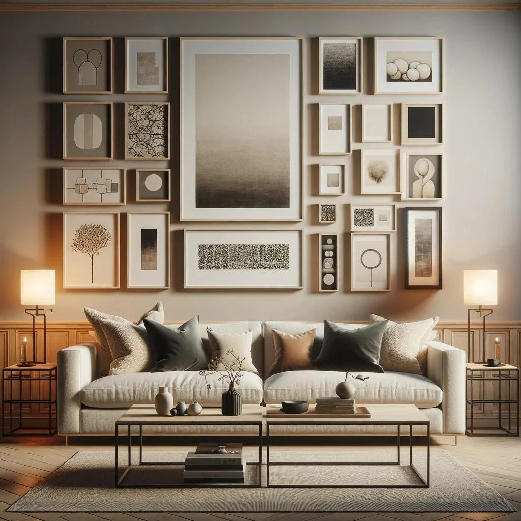
Symmetry-focused: My favorite one, this design emphasizes balance and structure, creating a clean and polished look. Ideal for homeowners who prefer order and harmony, this layout follows a clear geometric pattern:
Balanced arrangement: The artwork and frames are positioned to mirror one another either horizontally, vertically, or both, creating a grid-like effect. Each piece is evenly spaced for a sleek, cohesive appearance.
Consistency is key: Using frames of the same size, shape, and color keeps the design unified, while artwork in complementary tones enhances the overall symmetry.
Perfect for formal spaces: This layout is well-suited for areas like dining rooms, entryways, or offices, where a sense of order and refinement adds to the space’s elegance.
Image is AI created by Maru McHenry.
Don’t over think this step, find a few images you tend to love and follow a similar layout.
3. Mixing Art, Photos, and Decorative Elements:

I recommend mixing different types of artwork, photographs, and unique items (like mirrors or sculptures) to add texture and depth.
It’s important to balance the various pieces and frame sizes. You can add 3 different frame sizes to start,
Add 2 items or more of each category: 2 mirrors, 2 photographs and 2 art pieces.
Image is AI created by Maru McHenry.
4. Selecting Frames and Colors:
I suggest choosing frames that match or contrast with the room’s decor. Match the wood of your furniture for example, or a contrasting metal or color.
Sometimes matching the least used color in your fabrics is a great way to bring a fun color into your room.
Use frames of different materials (wood, metal, etc.) and finishes (black, gold, natural wood) for visual interest.
5. Spacing and Hanging Tips
The consistent spacing between frames for a cohesive look it’s very important, it will give that elevated gallery look.
To ensure level placement and proper spacing for your gallery wall:
Measure and mark: Use a measuring tape to determine even spacing between frames (2-4 inches is common). Mark spots on the wall with a pencil or painter’s tape.
Use a level: Place a level on top of each frame to ensure it hangs straight. For larger walls, a laser level can help align multiple pieces at once.
Start with the focal point: Hang your central piece first and build around it, ensuring each frame is level as you go.
Templates help: Cut paper templates of your frames and tape them to the wall to visualize the layout and adjust before drilling.
6. Refreshing the Look Over Time
I encourage my clients to update their gallery wall with new artwork, photos, or seasonal accents over time.
Also rotating pieces to keep the display fresh and dynamic, swap art work from others rooms, I do this every season.